Presentation Submission Guidelines
Back to Top
We strongly recommend uploading your presentation before the workshop (instructions will be emailed to all presenters). If you cannot upload before the deadline, then you must bring your presentation directly to the workshop meeting room on a USB storage device.
- Internet is not available in the A/V area; Downloading your presentation is not possible.
- If you bring your presentation on a laptop, be sure its USB ports are usable. Some company-provided laptops are locked down and cannot transfer files.
On-Site Presentation Computers & Software Provided
- Internet access is NOT available on presentation computers.
- The Windows computer will have the latest versions of the following software:
- Microsoft Windows
- Microsoft PowerPoint
- Adobe Acrobat Reader
- The Apple computer will have the latest versions of the following software:
- MacOS
- Microsoft PowerPoint
- Apple Keynote
- Installation of any additional software will not be permitted.
Loading Your Presentation On-Site
- It is not possible to load your presentation once your session has begun. Please pre-load your presentation as early as possible.
- You must use the provided computer at the presenter podium or table. There will be no connection to use your own laptop at the lectern.
- Power Pitch slides CANNOT be submitted on-site. They must be submitted to the Education Coordinator before the event.
- There is no speaker ready room.
- The pre-loaded version does not need to be your final version, as long as you load your final version before your session begins. Draft versions can be loaded and later updated. You can do this simply to test the fonts, animations, and videos, and then bring your final version in before your scheduled time. By loading a draft version, any potential issues can be discovered and corrected prior to presentation.
- Since editing time will be limited, please ensure that all fonts appear as expected and all sound/video clips are functioning properly. PowerPoint users can EMBED FONTS
 to ensure your text appears as intended. Commercial fonts and Apple system fonts cannot be embedded. It is recommend to avoid these types of fonts.
Slide Presentation Guidelines
Back to Top
Downloadable PowerPoint
Declaration Slides
for Oral Presentations
Accreditation Council rules require every oral presentation begin with the speaker making a disclosure of relevant financial interests or relationships. This disclosure must be done both via a slide and orally, and will be in addition to the published disclosures. Template files are provided here:
Showing Your Presentation
- The A/V staff will start each presentation.
- Once the presentation is launched, you will control the presentation from the lectern using a standard computer mouse.
- The left button will advance to the next slide and start movies.
- The right button will reverse to the previous slide. (Mac PowerPoint users will bring up a menu when the right mouse button is pressed.)
- The mouse will also function as a pointer. No laser pointers are provided.
- The sessions are digitally captured and a laser pointer cannot be recorded.
- There will not be a keyboard. If you do not want the mouse pointer to disappear during the presentation, please consult the A/V staff when loading.
Preferred Presentation Formatting

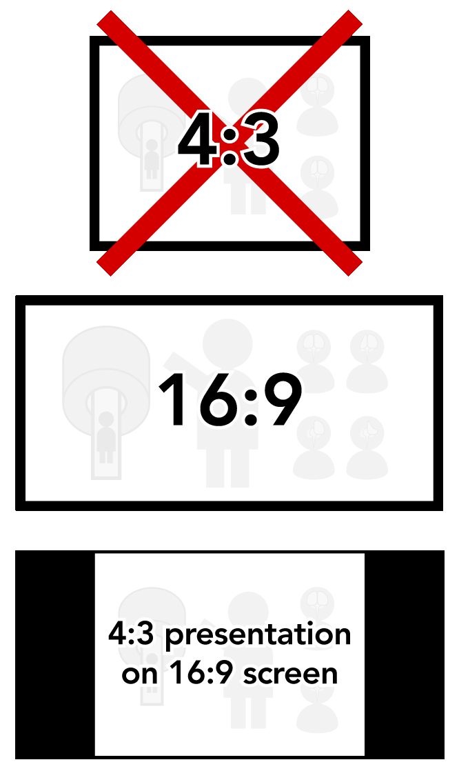
- This workshop will use a high-definition 16:9 format screen (see illustration), which can support a wide screen format.
- To use the widescreen format, check your PAGE SETUP setting before creating your presentation.
- Older versions of PowerPoint may have 4:3 as the default setting. Make sure to change this to ON-SCREEN SHOW (16:9) in order to make full use of the presentation screen.
- Changing this setting after the presentation has been created can cause format issues on slides.
- A presentation in the 4:3 format can be shown, but there will be black bars on both sides of the image (see example).
- Video files should be embedded into the presentation. Do not use linked video files.
- If using a video file for your presentation, it is imperative that it is tested on-site as early as possible to ensure it will play on the provided computers.
- If a video does not play on the provided computers, it may take hours to fix, if it can be fixed at all.
- Please note, just changing the file extension does not convert the file. Both free and commercial software is available for that purpose.
- Set your presentation to Loop Continuously to prevent an accidental ending of recording during capture. This option is found under the SLIDE SHOW -> SETUP SLIDE SHOW menu in PowerPoint.
- Please REMOVE ALL HYPERLINKS from any web address or e-mail addresses in your presentation. Simply highlight the text and select REMOVE HYPERLINK. An accidental click on a link will interrupt your presentation.
ISMRM Policy Regarding Presentation Slides
Content of CME activities will be restricted to pure science, industry issues, and operation of devices, and should not include any advertising, corporate logos, trade names or a product group message of an ACCME-defined ineligible company .
.
Presentations must give a balanced view of therapeutic options and use of generic names will contribute to this impartiality. Trade names or company names should only be used if essential. If included, where available trade names from several companies should be used, not just trade names from a single company.
How to Make a Video from Your Slideshow
Back to Top
Presenters can produce videos from their PowerPoint or Keynote slideshows. There are three main requirements for all videos submitted for inclusion in this conference:
Video Resolution: 1280x720 (720p)
Video File Format: .MP4 (H.264 codec)
Maximum video file size: 325 MB
Tips for Audio Recording:
- Find a small, quiet space to record in.
- Turn off loud machines and fans, especially air conditioners and heaters.
- Avoid spaces with echo. Rooms with bare walls, such as bathrooms and kitchens, often produce noticeable echo.
- Sound dampening (echo reduction) is easy and can be done with blankets, carpeting, curtains, furniture, and clothing. Soft items hung on a wall are great sound dampeners.
- A closet full of clothes is a great space for recording.
- Record yourself with a good headset or external microphone. Position the microphone just to the side of your mouth to reduce "pops" (bursts of air hitting the microphone, such as those produced by the letters p and b).
- Avoid using a built-in microphone, such as on a laptop computer or webcam.
- Speak loudly, clearly, and forcefully, as if you were outdoors and speaking to a group. The audience will not want to have to interpret mumbling or quiet speaking, and will lose interest or move on to the next video.
- Make a brief test recording and review both the sound and picture quality. You may also want to double-check the MP4 format and bit rate before recording the entire presentation. Make adjustments if needed.
Making a Video in
Apple Keynote
How to record narration and timings in Keynote:
https://support.apple.com/.../mac
- Click on the service menu on top of your screen File > Export To > Movie
- If you recorded a narration, you can click the Playback pop-up menu, then choose Slideshow Recording. If you want the slides to advance by themselves, you can leave the option Self-Playing.
- If you choose Self-Playing you can enter the time you want the next slide or build to advance. These timings apply only to click events.
- On the Resolution drop-down menu, click Custom and enter 1280px x 720px. Be sure to select the H.246 option. This is .mp4 and it is going to work on any device and software.
- Click Next…
- Enter a name in the Save As field. Be sure to name your file according to the instructions on this website, under the appropriate tab for your presentation type.
- To choose where to save the presentation, click the arrow next to the Where pop-up menu, then choose a location in the dialog. For example, it can be on the desktop. The default location Keynote chooses is the Keynote folder on your iCloud.
- Finally, Click Export.
For more detailed instructions, please visit Apple's website here:
https://support.apple.com/en-us/HT202220
Other software that can produce .MP4 files such as Camtasia or Zoom are also acceptable as long as the above file requirements are met.
Traditional Poster Guidelines
Back to Top
A traditional poster presentation combines a visual display on a poster board of the highlights of research with a question-and-answer opportunity. You will be assigned a time period during which you should be present at your poster for discussion and questions. In addition, the poster will be available for viewing by attendees during all hours the workshop is open.
Note: You must print your own poster, and it should be done before you leave for the workshop. Do not expect printing services on-site.
Measurements

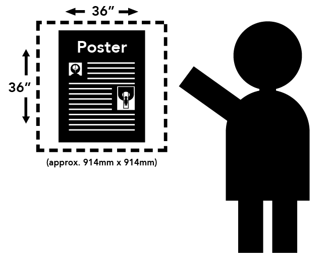
Each presenter is assigned a square space with maximum dimensions of 36 inches wide by 36 inches high (approx. 91.44 cm x 91.44 cm). Posters exceeding these measurements (i.e., extending into areas reserved for other posters) may be removed.
Posters will be attached to their spaces with either tape or push-pins, which will be provided at the workshop.
Suggestions for Preparing Scientific Posters
Content
- The poster should show the full title of your submission.
- Text should be brief and well organized, presenting only enough data to support your conclusions.
- The text should make clear the significance of your research.
- The text should include (most likely as separate elements of the poster) your hypothesis, methods, results, and conclusions.
Design
- A clear, simple, uncluttered arrangement is the most attractive and the easiest to read.
- For best legibility, it is suggested that the title lettering be at least 2 inches (5cm) high, with authors' names and affiliations smaller.
- All lettering should be legible from a distance of approximately 5 feet (1.5m). It is suggested that font size should be at least 24 point, in bold style. The typeface chosen should be a simple and clear one (e.g., Helvetica). Titles should be in all upper case letters. The remainder of the text should be in a combination of upper and lower case letters.
- Color should be used sparingly, to provide contrast. The featured parts of the poster can be highlighted with warm colors, and the less important parts can be done in cool colors. Some suggestions for color combinations are as follows: Green on white, red on white, black on white, blue on white, white on blue, and white on black.
- Illustrations should be simple and eye-catching, with unnecessary detail left out. If possible, convert tables to graphic displays. Pie graphs can be used to show parts of a whole, line graphs can be used to show trends or changing relationships, and bar graphs can be used to show volumes.
- Photos should be enlarged enough to show relevant detail.
- Standard computer printouts usually are not effective on posters, because the type is too small and the lines are too thin to be seen from a distance.
- Patient confidentiality must be protected. No names should appear in illustrations.
Back to Top


.
